DESIGN
How to build real brands
Have you ever wondered how to make your brand timeless? In this article I’ll give you my perspective on how to make a brand truly timeless and not limited by current trends.
Trends and fads
We’ve all fallen into the rabbit hole of reading articles about "graphic design trends" to see new aesthetic fads and figure out what’s trendy.
Being a GEN Z, I’m connected 24/7 to new trends, I know what’s being used and what people are currently obsessed with. We all know that everything is a revival of something in the past and every 20 years, approximately, trends make a comeback. But it’s not all a bed a roses and some trends are transitory. Whereas others pioneered many important artistic movements. So, how can we differentiate something ephemeral from that which is memorable and will endure through time without losing its magic?
Assess and reframe
In my early days, visual research was fundamental –and it still is– but I now see I overstated the importance of having references that were inline with trends to make sure I created brands that were “current” and I’m using quotation marks because: What is current? Would you rather create something trendy or something that’s timeless and memorable? Where do you draw the line? How do you find the balance between what you want to represent while not limiting yourself? In the design world nothing is new, everything has already been done–you’re probably not going to create a new aesthetic like Bauhaus or Swiss design–but you can reframe it through new ways of thinking about these movements, how they impact you as a designer, and how to use them when you’re creating and representing ideas.
Context is important
Obviously it’s important to understand the current context and where brands are going, what they want to communicate and who their target audience is. The ideal scenario is to be aware of all of this but not let it limit you when we’re creating.
Forget about something being old or new, just focus on being creative with all of that on the table. The magic of being a designer is to create by rethinking elements. You can do that with a trend from 2010, adding value and connecting it to what you’re trying to convey in the brand you’re designing.
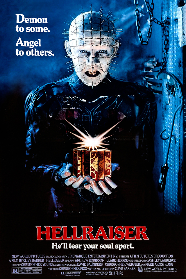
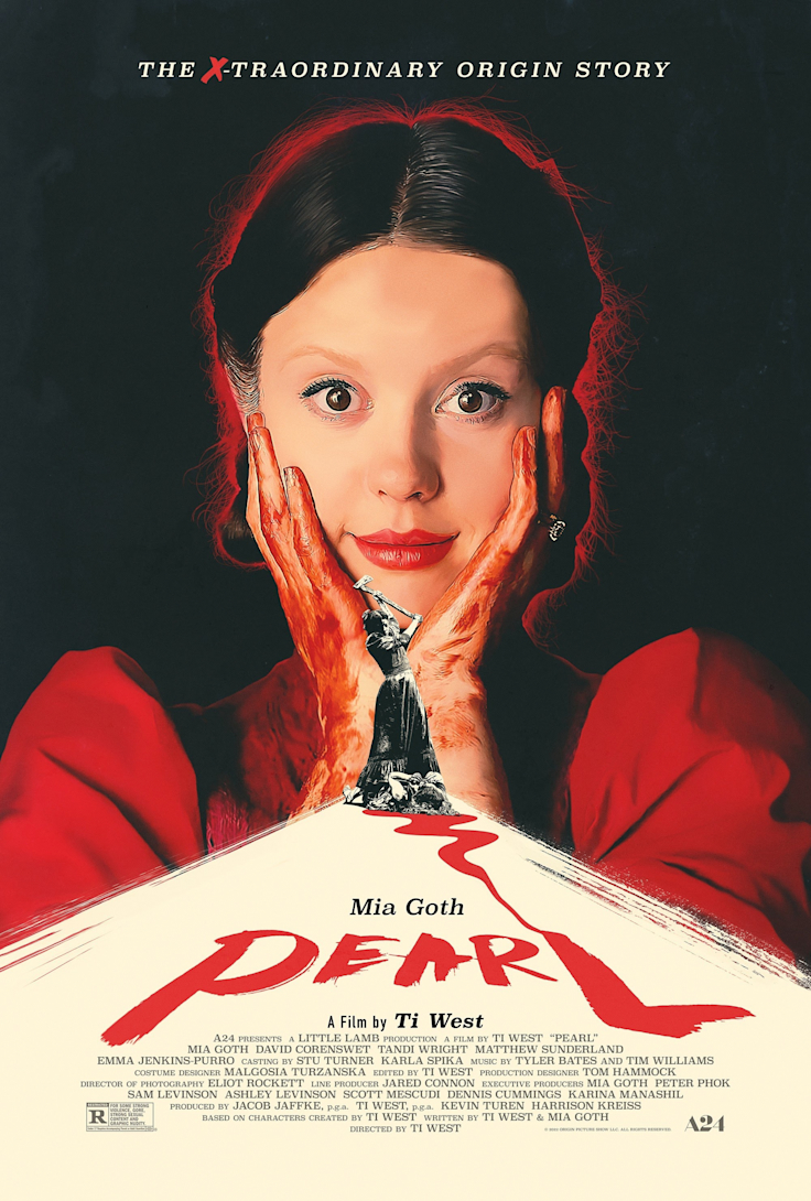
Take the film industry, for example: there’s a revival of old trends related to film posters. They have a nostalgic look and feel that moves you if you’ve already seen or experienced something similar. Lately, in terror, slasher, gore and sci-fi films, among others, old posters are being designed using this trend, taking you back to the nineties and even the eighties. And this is not a fluke, it’s an intentional design decision with a high representative value and strongly related to the target audience at hand.

Hellraiser, 1987

Pearl, 2022
💡 A clear example is Pearl, a movie with a pretty particular aesthetic alluding to graphic trends from the eighties and nineties. Even though it represents something from 20 or 30 years ago it still has the same impact; this is due to the fact that it’s based on values and what it’s trying to represent. There’s an existing niche and the audience will automatically know by looking at the poster if it’s a romcom or slasher movie.
Create memorable and timeless brands
Here are some tips to take into consideration when you’re in the creation process:
Define the brand’s values. It’s very important to bear this in mind when exploring visual references so that you can create something meaningful that’s aligned with the brand’s needs. Mission, vision, and values.
Research the competition to fully understand the brand’s context and their industry. Think about it like this: you’re in a supermarket in the cheese aisle, most of the packaging has many elements in common, but, what if I went crazy and created a totally disruptive graphic? Will the consumer be able to differentiate it from the rest of the cheeses? Is it evident it’s a cheese at first glance? It might be really pretty but even though you want to be creative, you still need to understand the context where this will circulate, and the fact that the user-client needs to be able to identify, at plain sight, the product you’ve designed and acquire it.
Believe me, I’ve been there, and it’s important to understand how to use your resources and when to apply moderation.
Highlight the brand values and differentiating attributes. To improve brand positioning you need to know the values you have to convey and find the right way to do it. Never loose track of the purpose you’re trying to communicate through the design and use rhetorical forms to display what you’d like to represent.
Content is important. Before you start designing, you need to have content, so that you can understand what visual paths to take. A tech company and a cheese product are two totally different things. Sorry, cheese fan here, let’s keep going. Starting the design process without having at least some keywords or elements to represent is a big mistake. Don’t forget that design is still communication. This is strongly related to the step about the mission, vision and values, as well as the brand’s differentiators.
Explore visuals. Oh yeah! Now you can get started with what you like best, starting with research on the competition, looking at references, reviewing past innovative trends and elements that could add value to the brand. Make sure you don’t limit yourself with these references and play around during the exploration phase. Remember that even if you have a weekly email filling you in on the key current trends, it’s important to decide based on the brand values that you need to represent and communicate. Nothing is more valuable than creating a timeless brand that connects to the brand’s needs-think about Coca Cola. Nowadays, nobody would dare to touch their logo. Cheese and Coke, I hope it’s not too obvious that I’m thinking about food 24/7.
Do you want to elevate your brand? Get in contact with us and we’ll help you out!