BRANDING
DESIGN
UX UI
DESIGN PROCESSES
The intersection between branding and UI
Let's imagine we’re starting to design a website or app from scratch. We know that from a visual and conceptual perspective, having complete branding is really important when taking the first steps. Brand manuals, the key deliverable of a branding process, usually include quick explorations of how the brand will be used in different scenarios. When we are beginning to design a website or product, however, we need a deeper exploration–precisely, looking at the brand in a digital scenario.
Today I’m going to tell you about a stage that gets integrated into the branding process, bringing a big impact with low effort, taking our branding deliverables to the next level.
Low effort, high impact
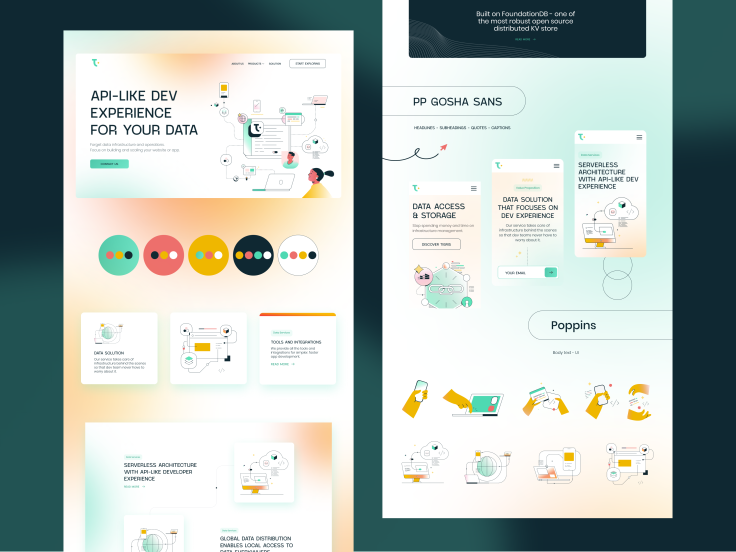
At Indicius we call this a Style Tile, but the name isn't important – you can call it whatever you like. This process helps in translating traditional branding on a digital level at the beginning of a project that hasn't yet defined anything related to the user interface. Is important to highlight that this is a visual exploration with a focus on visuals, which is why I say that this stage belongs to the branding process and not UX/UI. The Style Tile doesn't focus on creating a UI KIT, rather it focuses on scaling a defined branding, exploring how it will behave in a digital context.
How do we run this stage? Okay, let's think first about the most common elements of any digital interface. We can start this exploration by focusing on basic atoms like buttons, icons and text fields. At this point, we inherit the color palette from the branding, and we can take a deep dive into defining how the colors are going to be used. Also, we can test different uses of typography, which will give rise to a future TYPE KIT.
Then we start with the creation of molecules and organisms; for example, forms, data tables, sliders, dropdowns, cards and tabs. With all these elements generated, it's possible to create different templates and pages that respond to customer needs. If we are creating a Style Tile for a digital product that’s mainly based on data analysis, we know that the interface will be composed of forms, info cards, tables, pagination, typographic compositions with condensed info, different hierarchies of call to actions and complex dropdowns, among other elements. Therefore, without really knowing what the final product is going to be like, we can focus our exploration on the industry where this interface is going to be used. Let's think of another example: if we know that the Style Tile we’re creating will be later used for a marketing website we can explore compositions like heroes, contact forms, typographic compos, sliders, blog posts, quotes, client logo grids and team grids.

This is Branding
When creating a Style Tile, we use UI styles and elements that seek to conceptualize the branding we are working with. That is why we analyze and define the precise use of rounded corners, shadows, spacings, gradients and strokes, taking into account what these elements convey visually and what we want to convey in our design. We also can choose to explore two proposals and present them to the client to gather feedback and ensure we’re on the correct path.
Another situation we may face is receiving a branding that was created by someone else in which we identify some limitations. This is a good moment to make improvements – at least some basics like making sure there is enough color contrast between background and foreground content to ensure legibility, that the typographic pairings work, and that the palette has all the colors we need.
When carrying out this exploration, it’s important to get the most out of the resources we have. If wireframes were already created we can visualize the structure of the website or product that will be developed, getting to understand the elements and components that will be used on the interface. If we design these elements and components ourselves, we will achieve a more precise Style Tile exploration. Also if we have brand content – for example, the description of the company services, possible headings, a tagline, company mission, etc – we could use these copy assets in our design composition, making it more real instead of using Loren Ipsum. At Indicius, when kicking off a branding process, we run a Brand Narrative Workshop which provides us a report with different content assets that designers can use in explorations like the one I just described.
It's also possible that we’ll face this process without access to wireframes, content, or other definitions, but despite that, we can move forward. The best is not to attempt to reinvent the wheel and use other design work as a reference. We can find inspiration and patterns on Dribbble, Behance, and Figma Community. For example, if we are working on the brand of a crypto start-up we can look at these keywords on design websites and we’ll easily find patterns and UI structures that we can bring to our Style Tile and convey a more solid and fitting design for our client's industry.

Presentation is everything
At Indicius we have created multiple Style Tiles – personally I have designed many and have also had the chance to lead other designers in this process. An average scope for a Style Tile should be around a week and no more than 20 hours. It may sound like a short amount of time, and it's a personal decision if you prefer to invest more hours to cover details, but it's important to remember that this is an exploration – like a prototype or mockup – not a final website or UI KIT. Later, moving to the next stages on the roadmap, we will have time for that.
Everything we cover here is important to mention to the client, including defining the scope and the goal of the exploration and explaining what we’re going to be creating, in order to be aligned, be clear, and not create false expectations. When we’re presenting we focus on gathering feedback on the branding and visuals, leaving behind any conversation related to UX or information architecture for now. My recommendation is to create a desktop-sized one-pager with a visually impactful hero placed at the top and good storytelling that narrates the different concepts we are looking to communicate as we scroll.
Personally, I have delivered many Style Tiles and I was able to see the positive outcomes of this process. For the client it helps to reduce anxiety, since from really early on in the roadmap they are able to visualize how their digital product will look. For the designers, it helps kick off the UI stage with a solid, validated base.
I hope this article facilitates the necessary tools to try adding this stage to your branding process yourself, especially for those projects that converge in a website or digital product. You will achieve – with a low investment of hours – a deliverable that connects teams and processes.
Are you a designer looking to try this process in your next project? Do you have a project and feel like this Style Tile process is just what you were looking for? Don't hesitate to contact me at salvador@indicius.com


