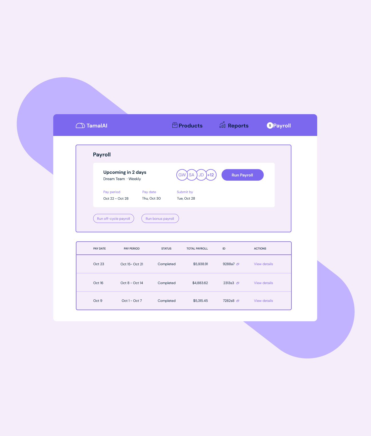
How can we build a website that speaks to all of Salsa’s audiences at once, while showing their unique value proposition for each use case?
When we first began our work with Salsa, they had a simple landing page that briefly laid out some of the benefits and functionalities of the product, with the goal of funneling customers to the “Get a demo” button. While this worked for them in the early stages, it was clear that to reach their goal of becoming the #1 payroll solution for software companies across the US and Canada, they would need a more comprehensive site that addressed all of Salsa’s possible use cases.
Salsa mainly serves three types of companies–Vertical SaaS platforms, HR and time management apps, and EOR/staffing agencies. While their main offering of simple embedded payroll is the same for all three, the team knew that there was specific language and benefits that would most resonate with each audience.
On top of that, they wanted to ensure that developers–the people in these organizations who would actually be working with the products–could see that Salsa was created with their needs in mind.
And of course–We always wanted to maintain Salsa’s simple, minimalistic brand identity to avoid overloading users with information.


